LRW MAnager Series Suite | BRANDING + PRINT DESIGN
Lieberman Research Worldwide (LRW) is a Los Angeles-based market research firm that gives people cutting-edge tools and resources to uncover insights about customers’ needs, emotions, and perceptions. As their Design Intern, I was given the opportunity to work on various proposals and presentations (qualitative and quantitative) and develop a variety of branded assets for the company’s internal materials.
Working with the LRW Talent team, I was able to tackle one of their biggest internal projects to implement the LRWU playbook on how managers should navigate their personal and professional leadership.

PROBLEM
The Manager Series Suite is a new management curriculum created by the company’s talent team that wanted to give a fresh look for their program launch. Some of their past presentations have been either too off-brand or seem to similar to a myriad of other proposals and decks presented within the company.

DESIGN CHALLENGE & Research
How might we be able to create a rebranded deck and handout templates within the project to be fun and unique while staying within LRW branding?
In order to fully comprehend the program components, I met with Abigail, the head of this project. Our kick-off meeting explored non-negotiable design requirements, visual references, and the project timeline. I started with solidifying the individual brand and creating the core elements that stay consistent throughout each deck.

VISUAL DESIGN
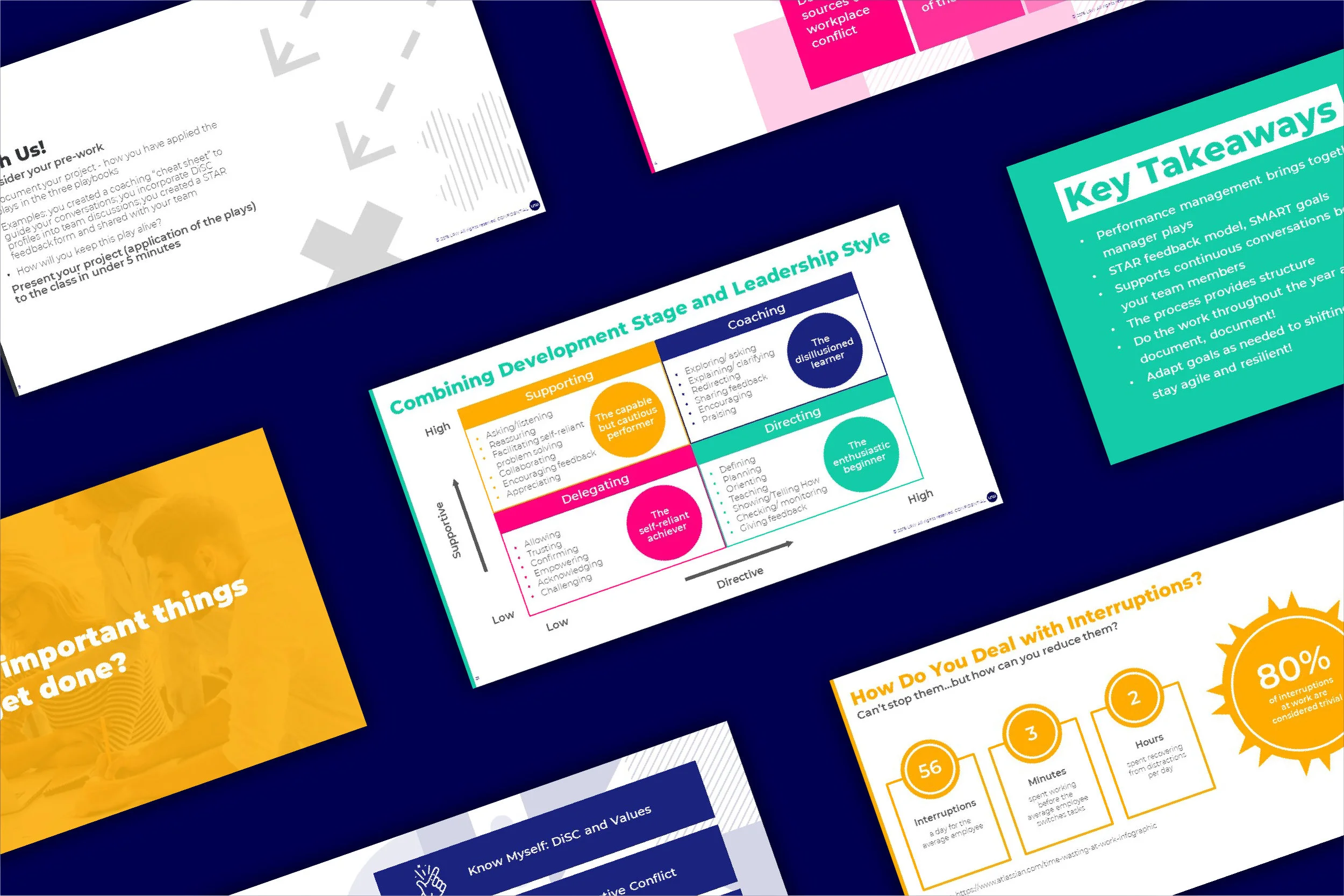
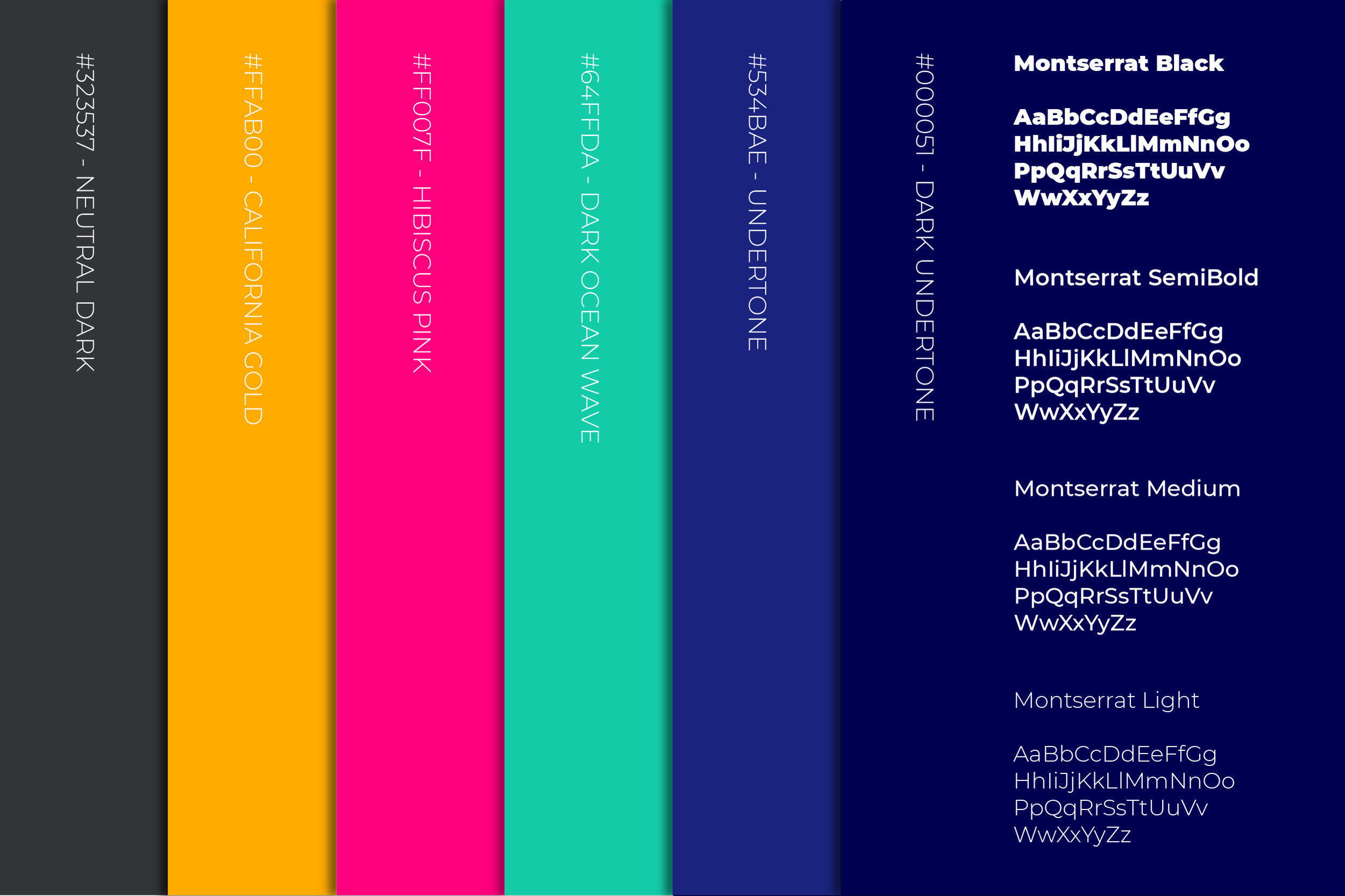
Since this deck was to be shared as an internal asset, I wanted to use the LRW colors and fonts to stay on brand but in a more visually playful and inviting design approach. I also wanted to distinctly identify each section with four strong individual colors and use the undertone and dark undertone colors for the management curriculum theme.

FIRST DRAFTS
The initial slides were within LRW branding however the overall look and feel were too overwhelming and generic for the client’s purpose. So, I went back to the drawing board.

FINAL PRODUCT
After numerous revisions and meetings, we came to a consensus. We decided to make new “x and o” motifs to parallel the idea of a sports playbook which was updated from the first draft. The cover page utilized a solid colored background and the ensuing slides are branded with a strip of color referencing the cover slide. These adjustments led to further legibility/clarity and gave a fun visual element to each slide.
The two handouts which would be printed and given out before and after each session, were created with the same fonts and have a solid color strip as well for consistency.